In the final week of the news editing course offered by Olivet School of Media and Communication (OSMC), journalism students studied the fundamentals of publication layout and design.
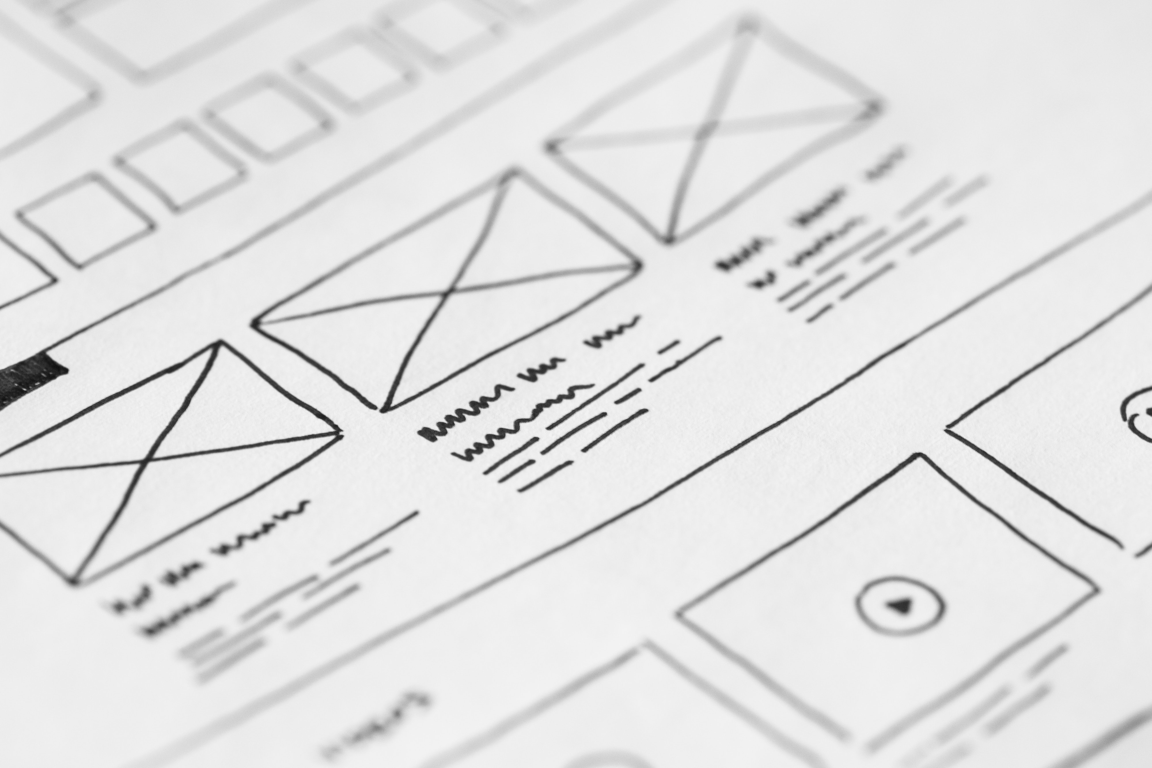
Publication design, whether on the web or in print, is as important as the news articles. In addition to the stories and images being powerful, they must be arranged in a way that is appealing and engaging. Design, the visual arrangement of stories, headlines, photos, videos and graphics on the page or screen should stand for the information itself. Extensive knowledge of design for an editor enables him to envision the design ahead and helps him in better planning and packaging the news.
Some basic design principles are widely used by web and print publications, such as visual anchor, contrast, proportion, balance, harmony/unity and the careful use of white (or empty) space. The goal of using these principles is to help readers establish a sense of priority on the information, simplify the process of absorbing the news and save readers’ time.
The design also speaks a lot about the brand. For example, the Wall Street Journal and Time magazine are strongly text-based, with small headlines and long columns of type, which generally suggests intellectual seriousness and constraint. USA Today and Wired magazine, on the other hand, are interactive and colorful. They are clearly targeted to the younger web-based generation. No matter what style of design is chosen, the key to maintaining the brand message is consistency.
To understand more about the use of typography and its effect, journalism students watch the PBS documentary “Helvetica” during class. The film further broadens students’ understanding of the role of graphic design in editing.